I am going to be using word but these instructions are easily converted to excel (see notes at the bottom). If you want to use excel (it is actually easier) then just use the cells in the upper left hand corner to make your table.
The notation I will use for menus will be as follows: File -> New means you should use the new option from the file menu.
Lets get started:
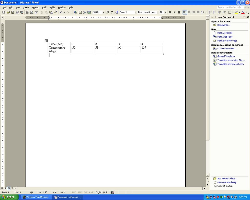
Step1: Making your Table: Add a table to your document by going to Table -> Insert -> Table Set the number of columns and rows appropriately, leave an extra row and column for labels. If you need to you can always add another row/column by clicking the table and going to Table -> Insert -> (whatever, row below for example). Now Enter your Data, you can use a simple setup as I am showing below (junk data) or something more complex, like I used in my original tutorial.
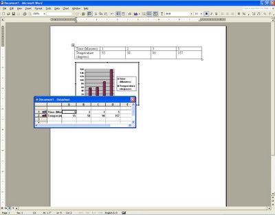
Step2: Select your data: Select your data in the table by holding the left mouse button down and dragging over the data or using select all from the edit menu or control+a (apple + a on a Mac). Now start your graph by going to Insert -> Picture -> chart. You should have something similar to this:
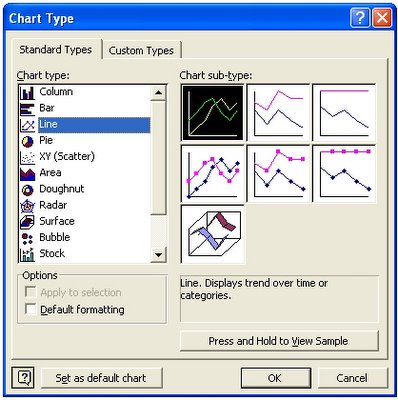
Step3: Setup your Graph: Word can generate a huge number of different graph styles. Goto Chart -> Chart Type to change the type (if the chart menu doesn't exist, double click the preexisting bar graph). You should get a dialogue which presents you with some different graph styles. On the left, click the general type you want (I am choosing line). On the right click the icon for the subversion you want. When you click an option you should see a description of it in the bottom right corner of the dialog. Click OK. The dialog should look like this:
Step 4: Add titles and change settings: Goto Chart-> Chart Options. Click through the tabs and fill things in. Most options should explain them selves. Be sure to enter a title and label the axes on the titles tab. Most of the other options are things you can set based on your preferences.
Step 5: Finishing touches/"Make it Pretty!": You can turn lines on and off (mine wanted to graph time on its own line) using the dialog labeled "Filename-Datasheet" by double clicking their number (look for a number on the left most column with a colored line on it, double click here). Also try double clicking various parts of the graph. If you double click one of the lines you can change its color/style. The same goes for the key and just about anything Experiment and you will figure it out. This guide is only intended to get you started. If you run into trouble email me or ask your paperclip.
Of coarse, if you don't want your chart embedded in a word document, you can use excel, which is much easier. Start off I mentioned before, fill your data in the first couple rows/columns of the spreadsheet. Select your data and goto Insert-> Chart. You will get the same style selection window as before, choose your types and click next. Use the series in option to tell excel if the actual data is in rows or columns (just click each option until the preview looks right). Click Next. Fill in the titles and other info as before and click next. Choose to create a new "sheet" in your "workbook" (a workbook is an excel file). A new sheet will show up as a tab in the bottom left hand corner of the screen. I would choose the new sheet option but do as you wish and click finish. Your graph/chart should show up and you can double click the lines/background/whatever to change its properties, such as color or line style. Make it look good. The default Pink and blue on grey is not what I would choose.
A few finishing notes:
This tutorial, or as they are called in computers HOWTO was written in a hurry, in my 5 minutes of spare time this afternoon. It is a followup to the better written and planned openoffice version (The excel method is very similar to the openoffice method whether you use writer or calc) If you find any errors please email me or (if you are reading this as a blog entry) post a comment. Also check out the computer tips section of my website for more. I am only posting this here to save Hopefully this is good enough to help some people!


No comments:
Post a Comment