Step 1: Draw a table with your data. This should be pretty straight forward (in OO.org try the table menu ;) ). Include any headings (Like time for example) as they will be used to label your axis on the finished graph. My table is as follows (I'm doing my AP Bio homework at the same time, as an example):
 Step 2: Now highlight the portion of the table you want to graph (all of it maybe?) and go to Insert-> object -> chart. Notice that if you do as I did, and merge the cells to put in a "Time" heading, you can not select this. Either put "minutes" after each time or just don't select that heading and we will put it in later. For now it just makes the table look better. You should get a window similar to the following:
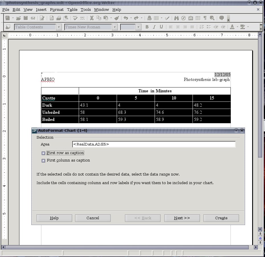 Step3: (Click Next): Choose your graph type (I think you can handle this, just click the one you want). I will be using a line graph. Notice the box labeled "Show text elements in preview". Check this to make sure that the correct data is in the correct place. If not, change the "Data Series in" option. For my table, I am choosing the rows option. See the screenshot:
 Step4: (Click Next Again!): At this page, you are offered some more choices. If you want you can select one of the other graph versions (such as percent change). I am just going to use normal. You can also check the boxes to toggle X and Y grid lines, if you want (I usually turn both on). I don't think this page needs a screen shot.
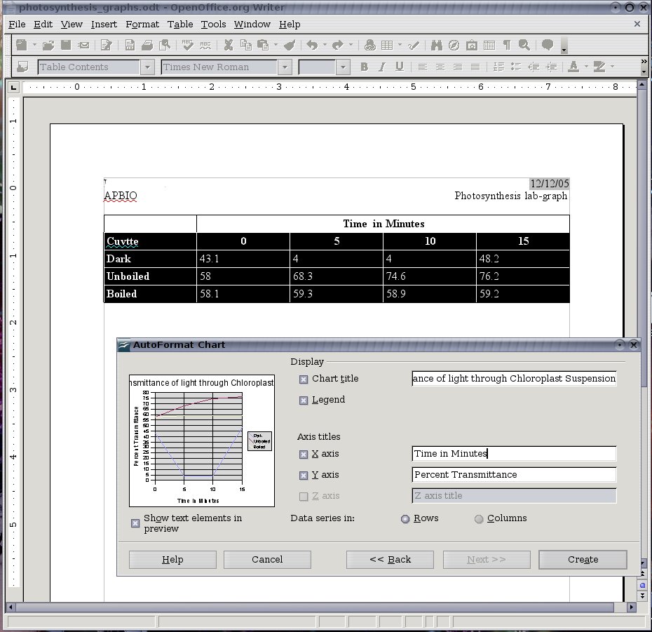
Step5: (Guess what: Click Next!): This step is important. On this page you can enter titles for the each axis and a main title (although the default is just a main title, so check the necessary boxes). Take a look at mine for an example:
Now all you have to do is click Create
Now you may notice that the font sizes need adjusting or there is some other problem (my title is cut off for example). You can double click the chart to get it into an editing mode. Then right click any of the objects (like the title) and select object properties. From here you can change font sizes and just about anything else. You can also resize the chart by clicking outside the chart and dragging it's little green sizing boxes.
You may want to hide your original table. This is done by right clicking your table, and clicking table in the context menu. Then, on the border tab, set the line style to none. Click ok, and select all the font in the table. Change its color to white by going to Format -> character. On the font effects tab select white from the font color dropdown box. Click ok.
That's all there is to it. I hope this helps someone ;)


3 comments:
Yes, it helped. Thank you! :)
Thanks!
thanks! it helped :)
Post a Comment